


COMMENTS
/* this is comment */
DIRECTIONS
xis left to rightyis top to bottom
COLORS
Related properties
color- Sets color of the text.background-color- Sets background color for text, container.background- Shorthand for bothbackground-imageandbackground-color.
Values
Color name
- 145 color names are available.
RGB
rgb(red, green, blue)- Each parameter can take values between 0 and 255.
RGBA
rgba(red, green, blue, alpha)- RGB color values + opacity
- "alpha" parameter can take values between 0.0 (fully transparent) and 1.0 (not transparent at all).
HEX
#rrggbb- r, g, and b represent the red, green and blue components respectively with values between 0 and f.
Points
black=rgb(0,0,0)=#000000white=rgb(255,255,255)=#ffffff- Background color applied to HTML body will be taken by whole HTML document.
Tools
UNITS
CSS units are used to define length/size of elements.
px- 1 pixel is 1 dot on screen.
- Absolute unit.
%- Depends on size of parent element.
- Relative unit.
em- Depends on size of parent element.
- Relative unit.
rem- Depends on size of root element.
- If value is not set explicitly for root element then font size of browser is considered as a base value.
- Relative unit.
vh- Depends on screen/viewport height.
- Relative unit.
vw- Depends on screen/viewport width.
- Relative unit.
calc()- Used to perform math operations (+ - * /).
- We can mix and match different values.
- Put space between operands and operator.
Related properties
font-size- Sets size of font.width- Sets width of an element.height- Sets height of an element.autois default value.min-height/min-width- Sets the minimum height/width of an element. It prevents the used value of the height/width property from becoming smaller than the value specified for min-height/min-width.max-height/max-width- Sets the maximum height/width of an element. It prevents the used value of the height/width property from becoming larger than the value specified for max-height/max-width.
Points
- Use
calc()to solve the issue of navbar and banner section height. For example, suppose navbar has height of 100px then banner height can be written as:.navbar { min-height: 100px; } .banner { min-height: calc(100vh - 100px); } /* It is better idea to use min-height instead of height so that content does not overflow */
OVERFLOW
- The
overflowproperty specifies whether to clip the content or to add scrollbars when the content of an element is too big to fit in the specified area. - Works only on block elements having
heightproperty. - The
overflow-xandoverflow-yproperties are used to control overflow in horizontal and vertical direction separately.
Values
visible(default) - The overflow is not clipped. The content renders outside the element's box.hidden- The overflow is clipped, and the rest of the content will be invisible.scroll- The overflow is clipped and a scrollbar is added to container element to see the rest of the content.auto- Similar toscroll, but it adds scrollbars only when necessary.
TYPOGRAPHY
Related properties
font-sizefont-family- We can use comma-separated values as a fallback fonts. At the end of font-stack, use generic fonts like serif, sans-serif, cursive, fantasy, monospace.
- If value contains space, use quotes around it.
- For example,
font-family: "Times New Roman", Times, serif;
font-style- Values -
italic,oblique,normal(default)
- Values -
font-weight- Thickness of font.
- When using google fonts, use values which are imported.
- Generally, 400 for normal text and 700 for headings.
text-align- Values -
left,center,right,justify
- Values -
text-indent- Indents first line of text to specified length.
line-height- Spacing between two lines.
- We can use any unit. If used just a number, value will be font size * number.
letter-spacing- Spacing between two letters.
word-spacing- Spacing between two words.
text-decoration- Values -
none(default, except for anchor tags),underlineetc.
- Values -
text-transform- Values -
none(default),capitalize,uppercase,lowercase
- Values -
BOX MODEL
All HTML elements are boxes.
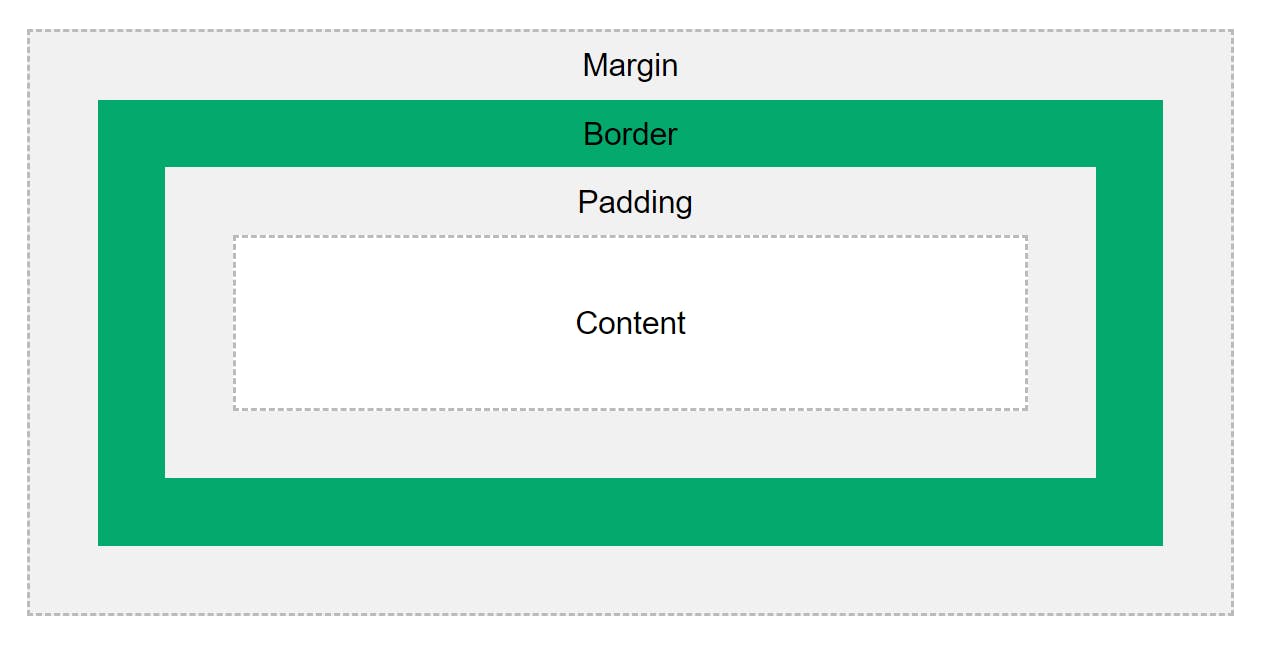
Related properties
box-sizing- Specifies the behavior of the
widthandheightproperties. - Default value is
content-boxand thereforewidthandheightset for an element are applied to content of the box. It leads to unexpected results as paddings and borders are also added to overall dimensions of box. - When value is set to
border-box, padding and border gets included in an element's total width and height.
- Specifies the behavior of the
Points
- Top and bottom margins of two elements are collapsed into a single margin that is equal to the largest of the two margins. This does not happen on left and right margins.
- Margins can be negative.
DISPLAY
The display property specifies how an element is displayed.
Values
block- Elements start on new line and span full width.
- To center an element, give it a
widthand applymargin-left: auto;andmargin-right: auto;
inline- Elements do not start on new line and span only content's width.
- Following properties don't work on inline elements -
width,height,margin-top,margin-bottom - To center an element, apply
text-align: center;on parent element.
inline-block- Elements behave like inline elements but it is possible to use
width,height,margin-topandmargin-bottomproperties.
- Elements behave like inline elements but it is possible to use
none- Removes element from flow.
- Space is collapsed.
HIDE AN ELEMENT
Following properties can be used to hide an element:
opacity: 0;- Space occupied by element is preserved.visibility: hidden;- Space occupied by element is preserved.display: none;- Element is removed from flow and space is collapsed.
BACKGROUND IMAGES
Related properties
backgroundandbackground-image- Value is
url("<relative path to image>"). - Specifies which image to use.
- Value is
background-repeat- Default behavior - If background image is smaller than container, it repeats to fill the space. If image is larger than container, it fits partially in container.
- Values -
repeat(default),no-repeat,repeat-x,repeat-y.
background-size- Specifies size of background.
- Values -
contain,cover. - Read MDN Docs
background-position- Specifies the initial position of the background image within its background positioning area.
- Takes value in the
<x> <y>format where x is position along X-axis and Y is position along Y-axis. - x values -
left,right,center, length, % - y values -
top,bottom,center, length, % - Default value is
0 0, that’s why images start from top-left corner of element.
background-attachment- Values -
scroll(default),fixed. - When we use
fixedvalue, background is applied to viewport, but is visible only inside element to which it is applied.
- Values -
LINEAR GRADIENTS
- For linear gradients, we use
backgroundorbackground-imageproperty and uselinear-gradient()function as a value. - Syntax -
linear-gradient(direction, color-stop1, color-stop2, ...)ORlinear-gradient(angle, color-stop1, color-stop2, ...) - Along with color-stop we can specify % distance from starting position where particular color should start.
- For transparent gradients, use
rgba()andtransparentcolor values. - Example of background image overlay:
.hero-section {
background: linear-gradient(rgba(0, 0, 0, 0.6), rgba(0, 0, 0, 0.6)),
  url("./demo.jpg");
}
Tools
POSITIONS
Related properties
position- Specifies the type of positioning for an element.top- Sets the top margin edge for a positioned box.bottom- Sets the bottom margin edge for a positioned box.left- Sets the left margin edge for a positioned box.right- Sets the right margin edge for a positioned box.
Values for position
static(default)- Element is positioned according to normal flow.
top,bottom,left,righthave no effect.
relative- Element is positioned relative to its normal position.
- Space is not collapsed.
- When using
%unit fortop,bottom,leftandright, parent's dimensions are considered. topmeans push from top(goes down),rightmeans push from right(goes left) and so on.
absolute- Element is positioned relative to the closest parent with
position: relative;. If no such parent is present, element becomes relative to body. - Space is collapsed and other content takes space.
topmeans distance from top of parent,leftmeans distance from left of parent and so on.
- Element is positioned relative to the closest parent with
fixed- Element is positioned relative to viewport (screen).
- Element stays at fixed position as we scroll.
- Space is collapsed and other content takes space.
topmeans distance from top of viewport,leftmeans distance from left of viewport and so on.
sticky- Position toggles between
relativeandfixed. - Once the position is met in the viewport, then it becomes fixed.
- Space is not collapsed.
- Use one of the values among
top,left,bottomandright.
- Position toggles between
MEDIA QUERIES
Media queries makes content rendering to adapt to different conditions such as screen resolution (for example, mobile and desktop screen size).
Mobile First Design
- Mobile first design is efficient to write.
min-width= Starting from (Recommended to use)max-width= Up to- When having multiple media queries for multiple sizes:
- If using
min-width, start from smaller to larger size from top to bottom in CSS. - If using
max-width, start from larger to smaller size from top to bottom in CSS.
- If using
Example
@media screen and (min-width: 800px) {
  body {
    background: red;
  }
}
Z-INDEX
z-indexproperty takes integer values.0is default value.- Higher the value, element becomes closer to us and lower the value, element goes away from us.
- Does not work on elements with
position: static;.
PSEUDO-ELEMENTS
Syntax
<selector>::<pseudo-element> { <property>: <value>; }::beforeand::after- The
::beforeand::afterpseudo-elements can be used to insert some content before and after the content of an element respectively. contentproperty is required.- They do not work with
<img>element because image itself is a content. We need container elements to work with there selectors. - Example:
p::before {
content: "hello";
display: block;
color: white;
background: red;
}
- The
SELECTORS & COMBINATORS
CSS selectors define the elements to which a set of CSS rules apply.
Resources
TRANSFORM
The transform property lets you rotate, scale, skew or translate an element.
Resources
Points
- When using
%intranslate(), it refers to width or height of element itself.
TRANSITIONS
The transition property allows you to change property values smoothly, over a given duration.
Resources
ANIMATIONS
The animation property allows you to animate elements. Transitions have only two states, start and end whereas animations have multiple states.
Resources
Example
/* Apply animation to the element */
div {
  width: 100px;
  height: 100px;
  background: pink;
  animation: example 4s linear 2s;
}

/* Define the animation */
@keyframes example {
  0% {
    background: red;
  }
  33% {
    background: yellow;
  }
  66% {
    background: skyblue;
  }
  100% {
    background: green;
  }
}
CSS VARIABLES
- CSS variables allow you to store values in one place as custom properties and reuse it later.
- The variable name must begin with two dashes (--) and it is case sensitive.
- CSS variables can be used with any property.
Declaring a variable:
--<variable-name>: <value>;Accessing a variable:
<property>: var(--<variable-name>);To create a variable with global scope, declare it inside the
:rootselector.- To create a variable with local scope, declare it inside the selector whose children and descendants are going to use it.
- VS Code suggests variables as we type
--in place of values.
ROOT SELECTOR
- The
:rootCSS pseudo-class matches the root element of a tree representing the document. In HTML,:rootrepresents the<html>element and is identical to the selectorhtml, except that its specificity is higher. - It is used to apply general styles, declare CSS variables and set up root font size (setting base value for rem unit).
:root {
--main-clr: red;
font-size: 16px;
}
FONT-AWESOME ICONS
- Either you can use CDN or download fonts and link all.css to HTML document.
- You can access icons with
<i>element with some special classes. - You can change size and color of icons using CSS.
SHADOWS
box-shadowproperty adds shadow effect to the element.text-shadowproperty adds shadow effect to the text.- Syntax:
<shadow-property>: <x-shadow> <y-shadow> <blur> <color>; - To add more than one shadows, write comma-separated list of shadow values.
Tools
OBJECT FIT
Related properties
object-fit- Sets how an
<img>or<video>elements should be resized to fit its container. - Values -
fill(default),contain,cover,none,scale-down - If we use
object-fit: cover;then the image keeps its aspect ratio and fills the given dimension. The image will be clipped to fit.
- Sets how an
object-position- The
object-positionproperty is used together withobject-fitproperty to move the image around the content box. Syntax:
object-position: <x> <y>;
/* x => left/right/center/length/percentage */
/* y => top/bottom/center/length/percentage */
Default value is
50% 50%. This is the reason when we applyobject-fit: cover;orobject-fit: contain;, the image is positioned in center by default.
- The
Example
img {
  width: 200px;
  height: 300px;
  object-fit: cover;
  object-position: 30% 100%;
}
BROWSER/VENDOR PREFIXES
Browser/vendor prefixes are a way for your browser to support new CSS features before they become fully supported in all browsers. Vendor prefixes help developers use those new features, and have them supported instantly without having to wait for each of them to become available for every browser.
Tools
For browser compatibility: caniuse.com
For prefixes: shouldiprefix.com
FLEXBOX
Resources
OTHER USEFUL PROPERTIES
visibility- Shows or hides an element without changing the layout of a document.
- Values -
visible(default),hidden
opacity- Controls transparency of an element.
- Takes values between
0.0(completely transparent) and1.0(completely visible). - Default value is
1.
list-style-type- Set
noneto remove bullet points of list items (<li>).
- Set
TIPS
- If you see some unnecessary white space below an image, set it
display: block;to get rid of it. <div>is used to group the block elements.<span>is used to group inline elements.- Inheritance: Children inherit styles from parents, unless have their own styles.
- Inheritance - Children inherit styles from parents, unless have their own styles.